


21
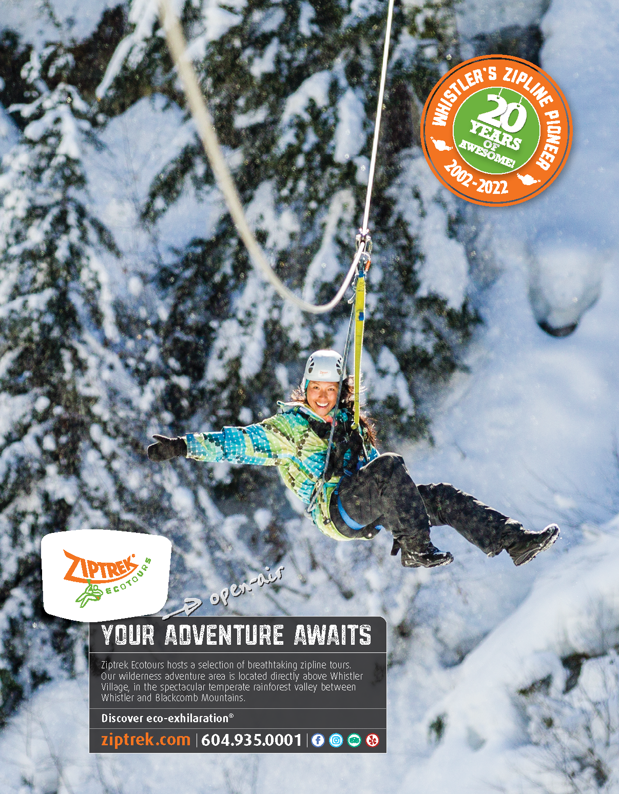
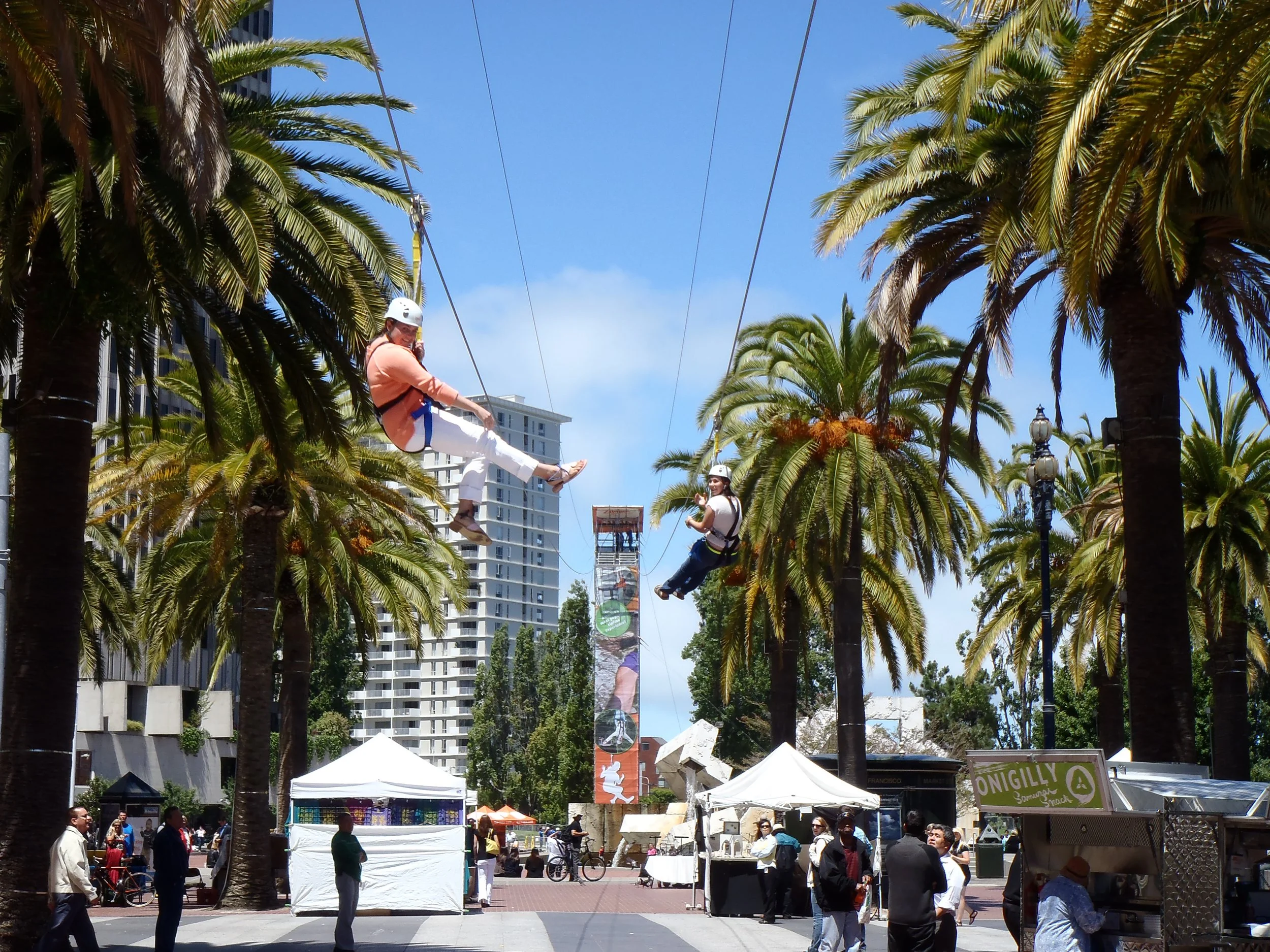
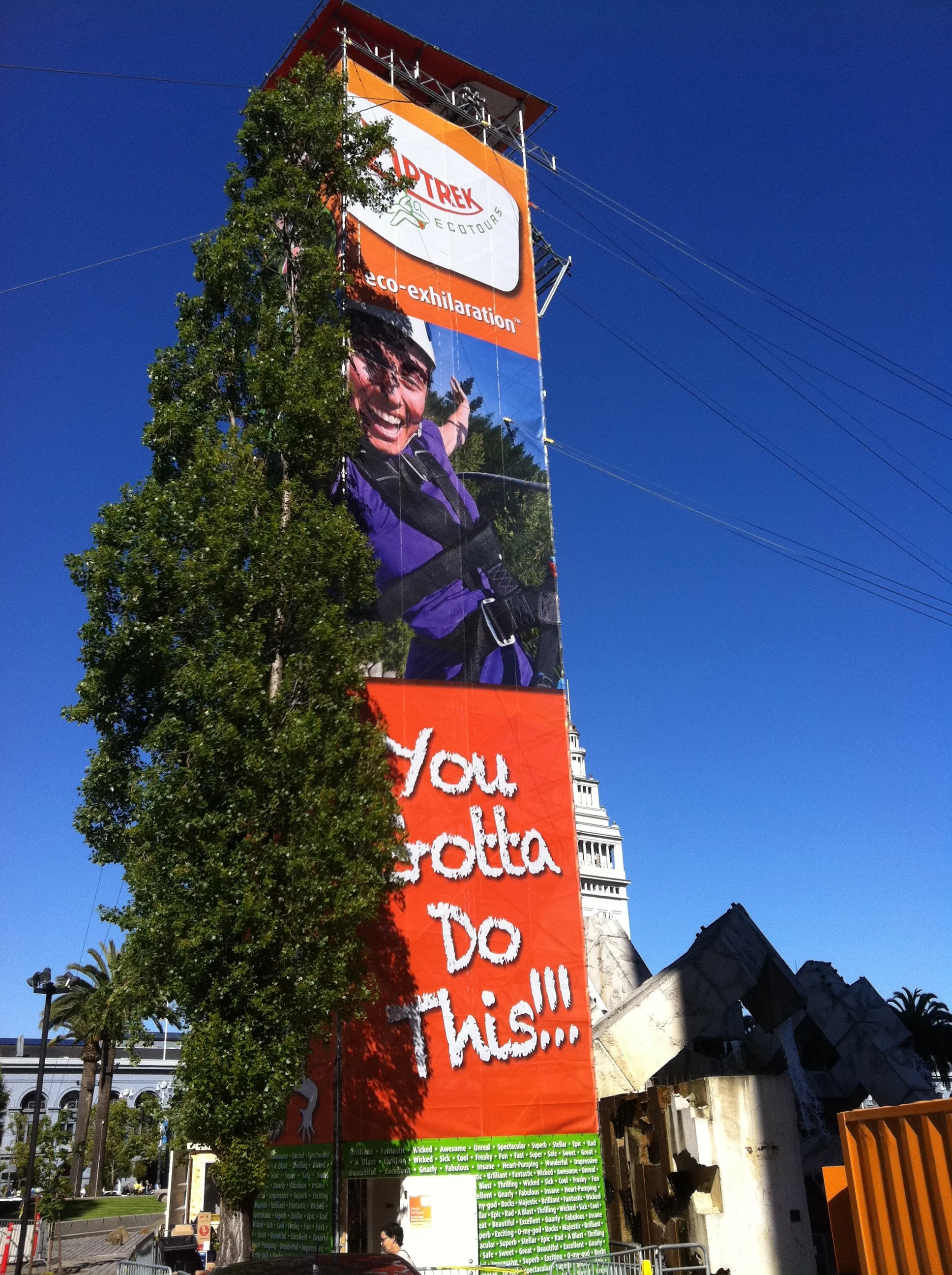
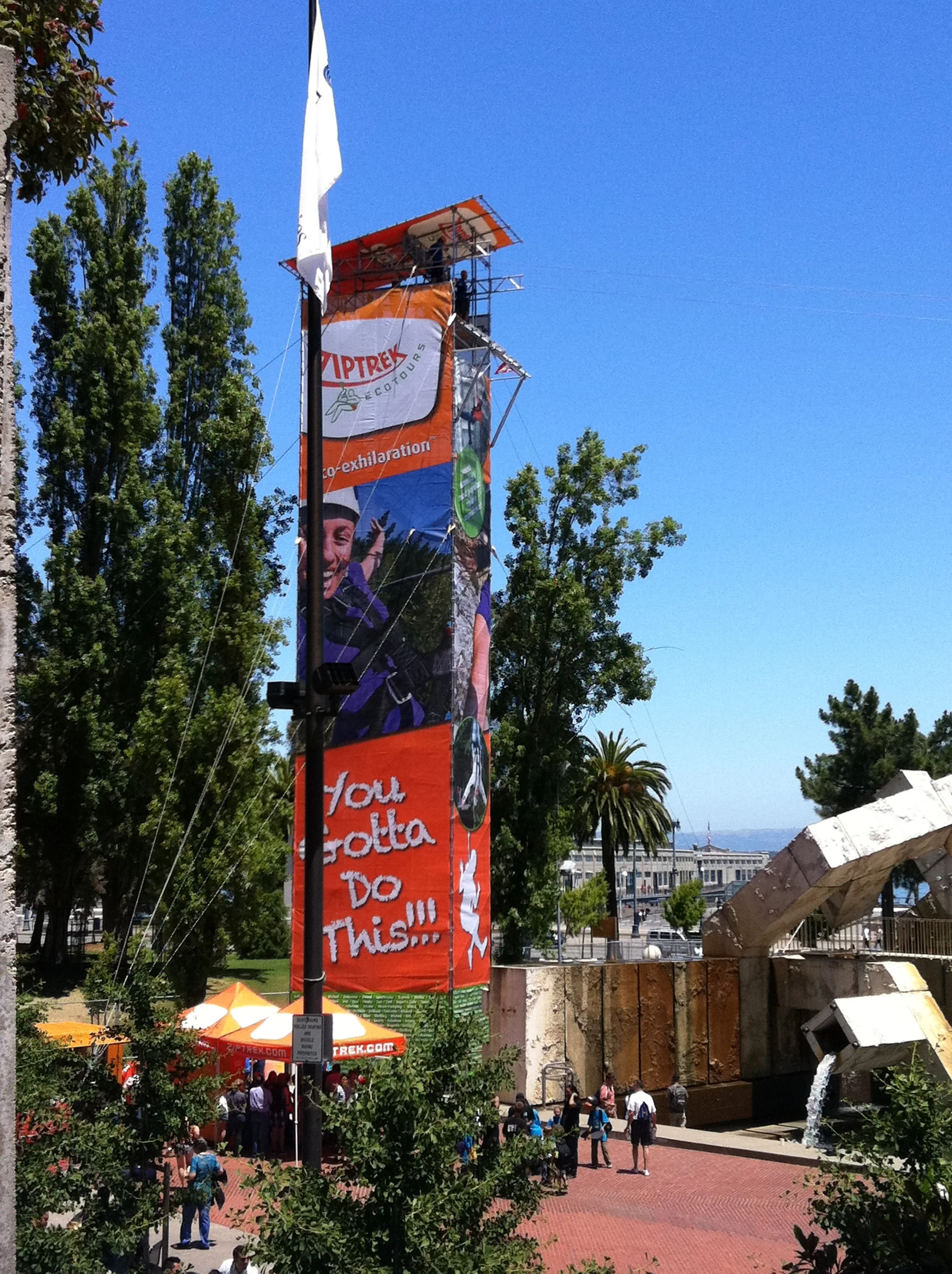
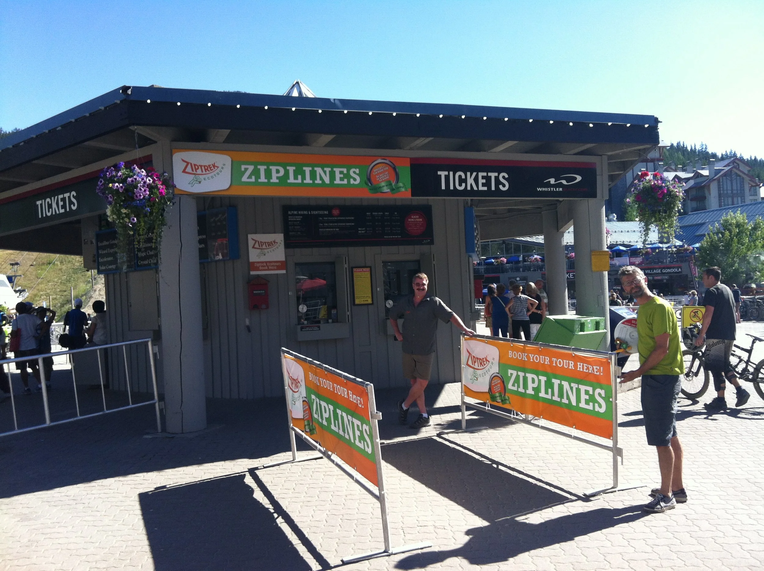
Ziptrek Ecotours

6
Telus

3
LasikVision

1
Paradise Ranch

2
E3 footgear

3
Syngenic • Nutraceuticals
3
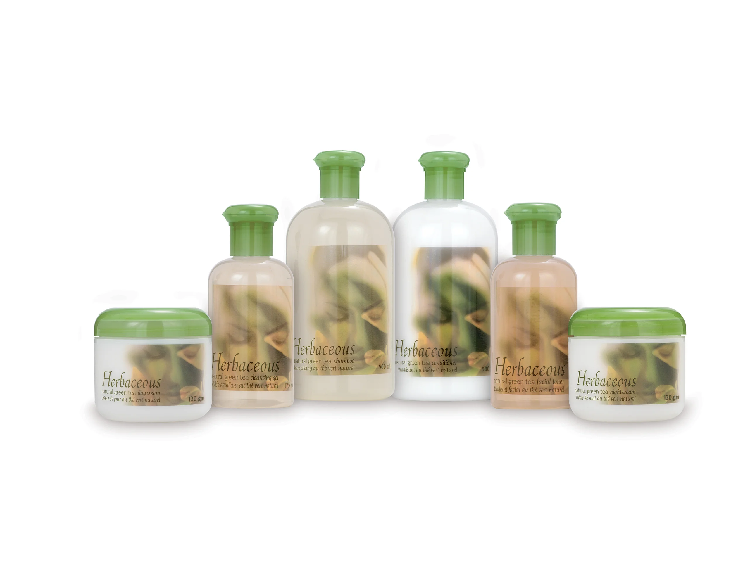
Herbaceous

1
BC Lions

4
Moosecreek Village

5
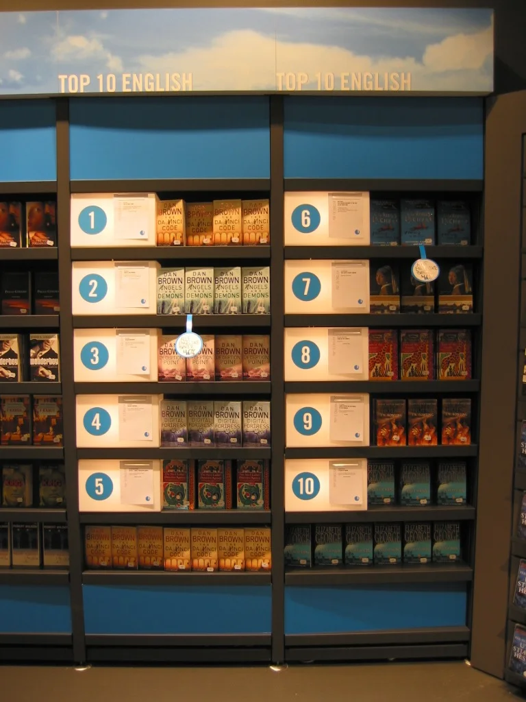
ARK Pocket • Bookstore

2
Columbus Group

2
Kraft Foods

5
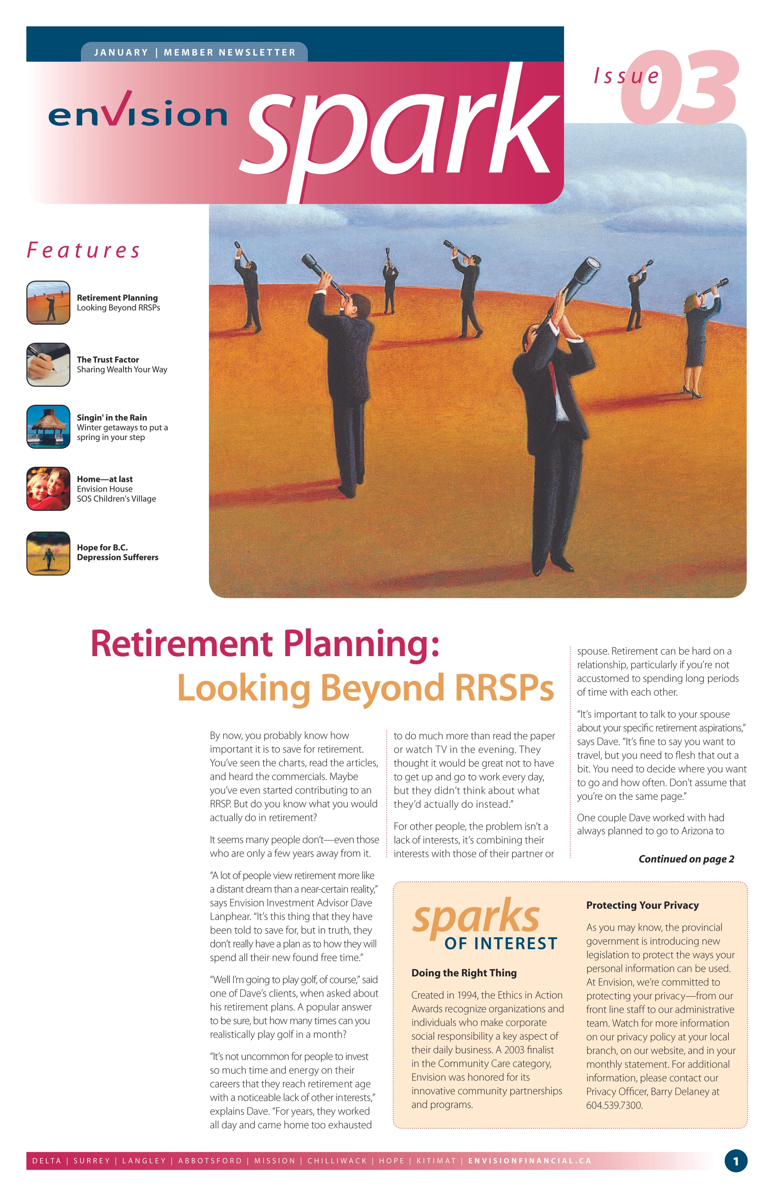
Envision Credit Union • Spark
1
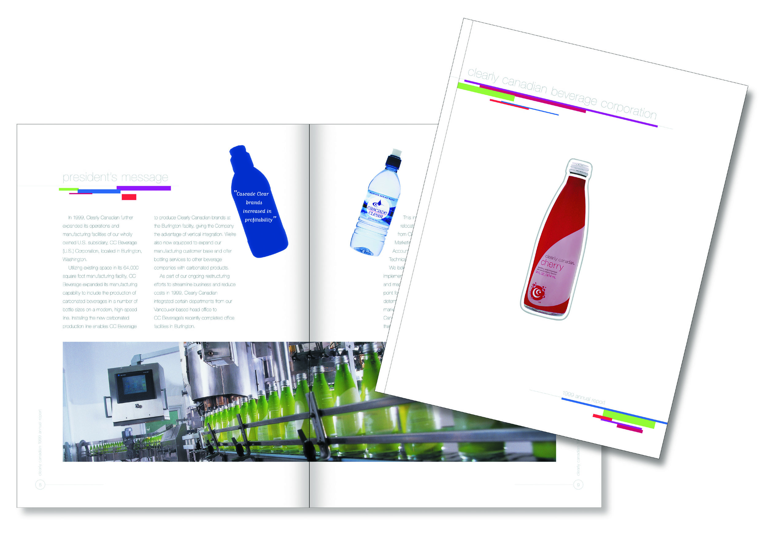
Clearly Canadian

2
Arthritis Research Canada (ARC)

4
7-Eleven retail display